Pending
A private marketplace for buying and selling homes. Built from zero, shipped in 8 weeks for a VC accelerator.
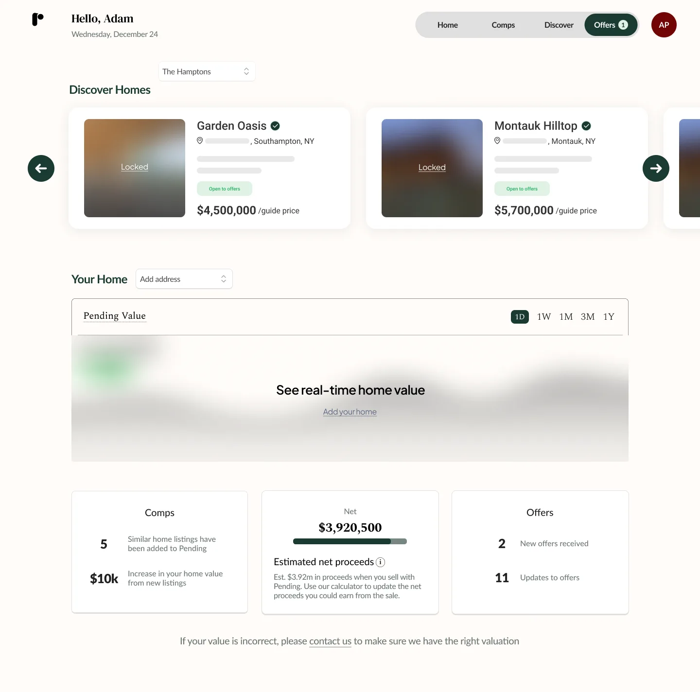
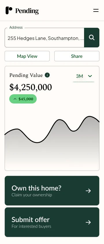
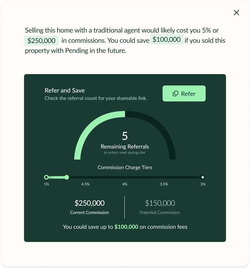
The core dashboard experience. Real-time home value, comparable properties, and offer activity in one view.
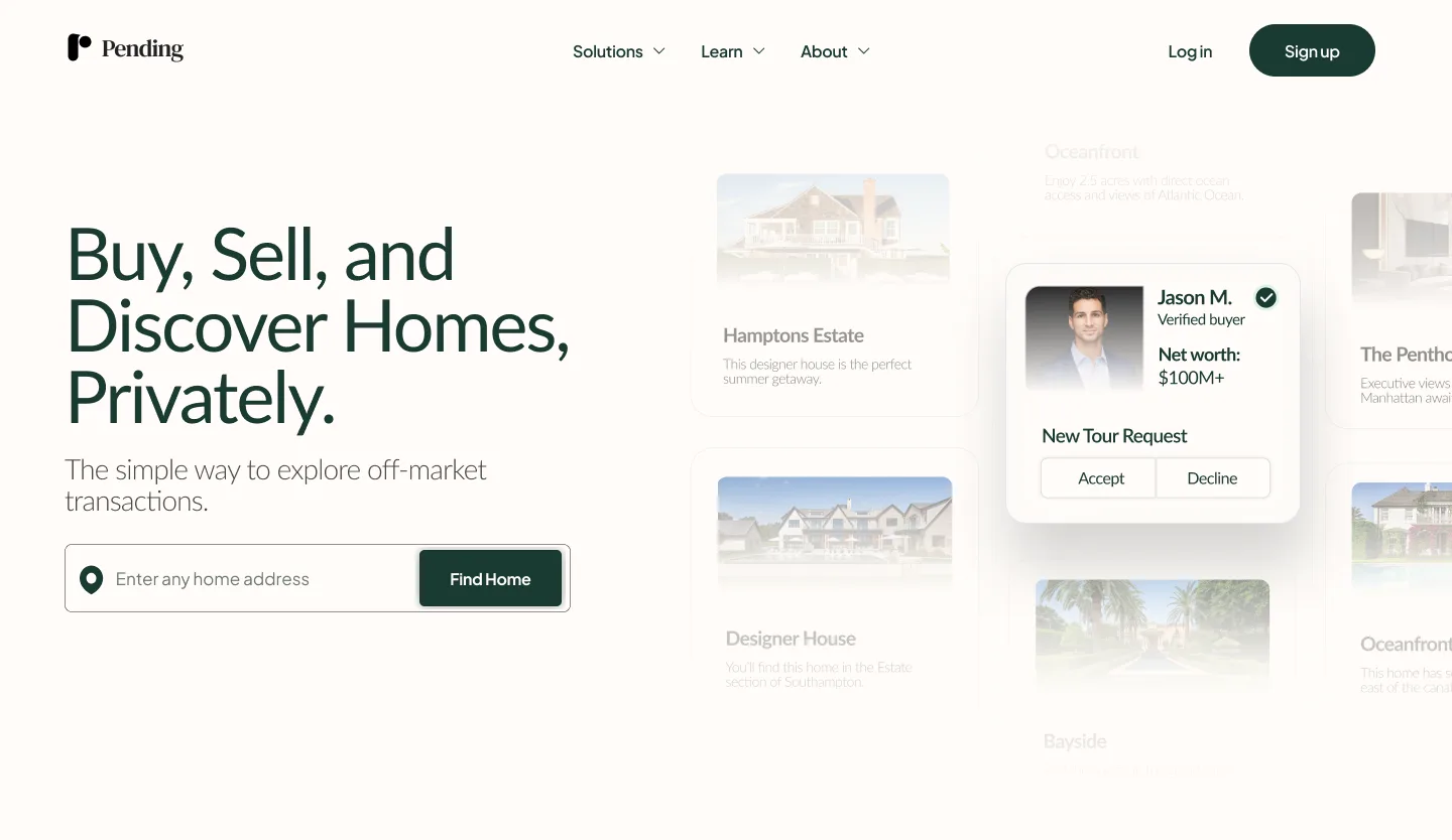
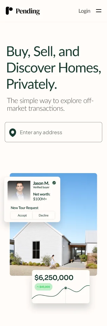
Real estate has a privacy problem. The platforms with the most reach force you to go public the moment you list. Your neighbors know. Your timeline is visible. The pressure starts immediately.
Private sales solve that, but they cap your reach, limit your options, and leave you negotiating blind. Most homeowners also have no clear sense of what their home is worth right now, not a year-old appraisal, not an estimate, but a live number that reflects the current market.
There was no middle ground. Pending was built to close that gap.
Not a listing platform. A financial control center for your home.
The guiding question throughout: what does this feel like if homeowners are in control at every step? That shaped everything from the dashboard structure to the offer flow. Less marketplace, more tool you trust with one of your biggest financial decisions.
What shaped the product
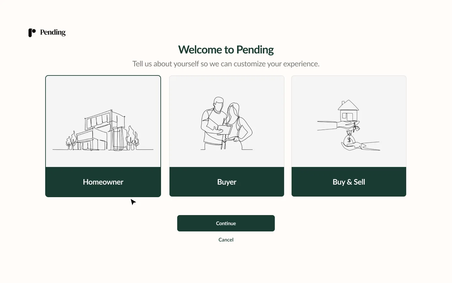
One experience, not two
The initial spec split buyers and sellers into separate flows. I pushed back early. Most target users are both — a homeowner at this price point buying a new property is also likely selling. Splitting the experience meant doubling the surface area, duplicating logic, and creating a divide users would never actually feel. A unified experience reduced complexity and gave us room to scale without fragmenting the core.
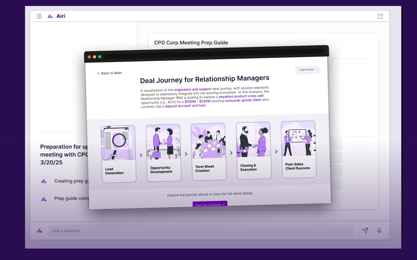
Treating offers like checkout
Home transactions are high-stakes. But the interface doesn't have to reflect that weight. I borrowed from e-commerce: structured inputs, clear state transitions, a defined offer lifecycle (submitted, countered, accepted, declined). No open-ended negotiation fields where precision matters most. The goal was not to oversimplify something complex. It was to give users a clear, confident path through it.
Progressive feature gating
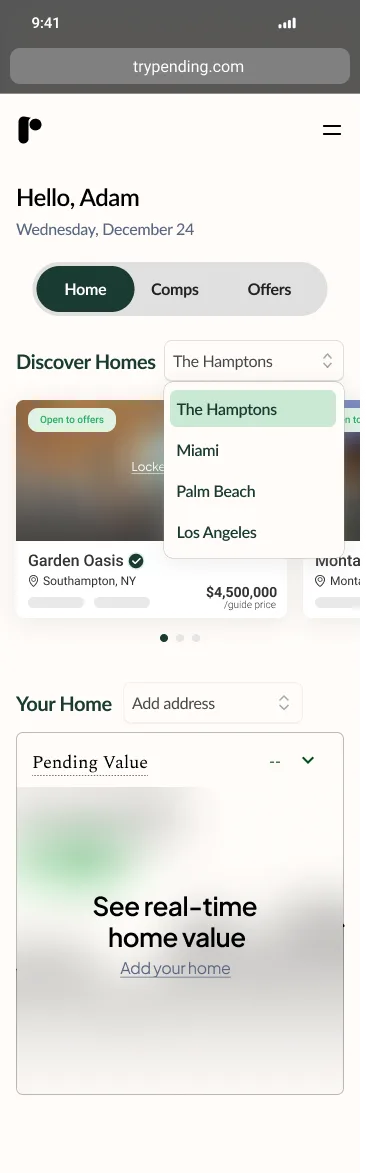
Users could browse and explore without committing. But core features, real-time value tracking and offer activity, required registering a property first. Two purposes: it filtered for intent, and it created a natural activation moment tied to real value. Some early drop-off was the tradeoff. A more engaged user base from the start was the result.
Designing for trust, not just usability
The target user: homeowners with $2.5M+ properties. Financially sophisticated. Not always tech-savvy. Privacy-first. This audience doesn't need hand-holding. They need confidence. The design had to communicate competence through restraint: clean information hierarchy, no noise, no unnecessary steps. Transparency built into the structure, not just the copy. Comps, net proceeds, offer history. All visible, nothing buried.
The product, end to end
Step-by-step, screen by screen.
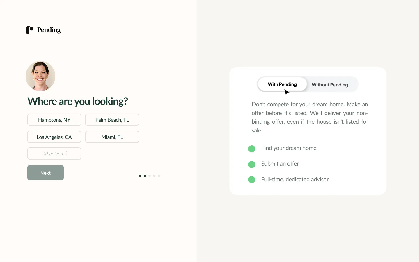
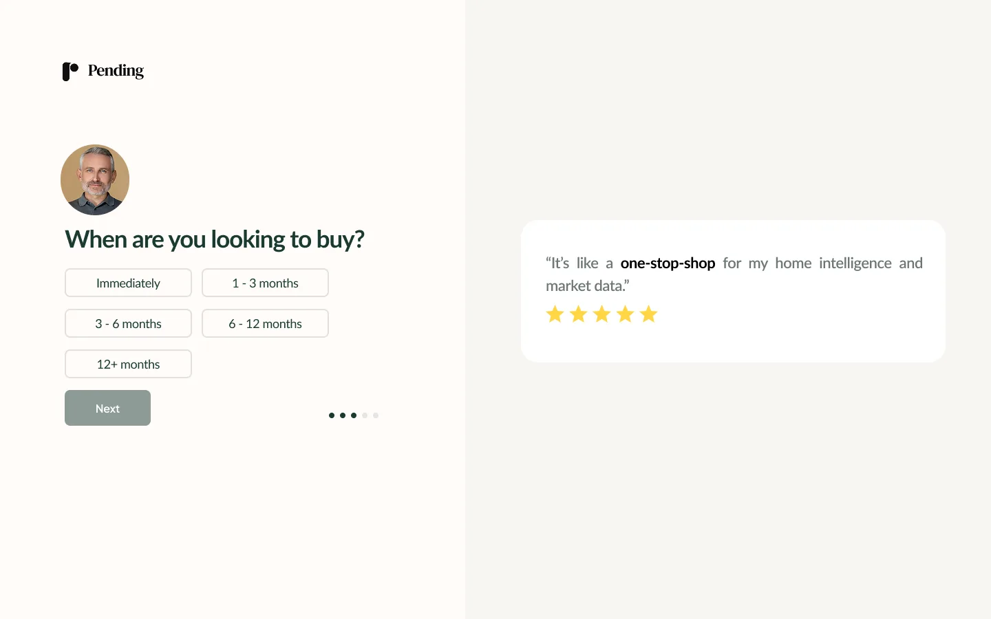
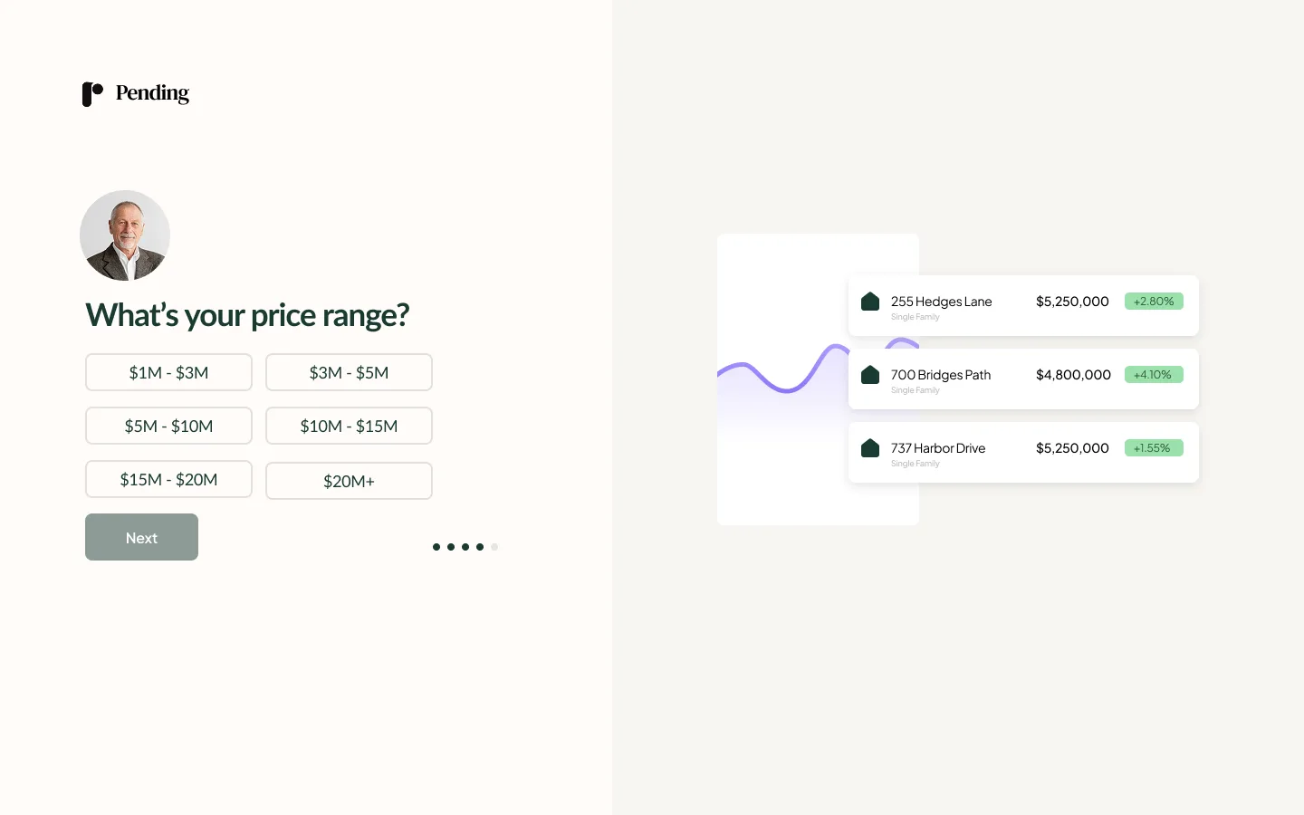
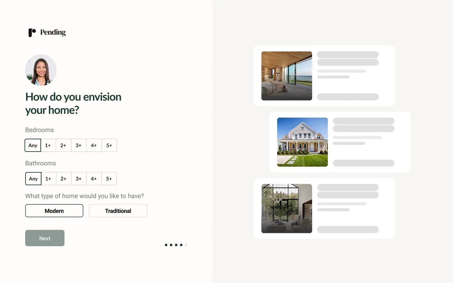
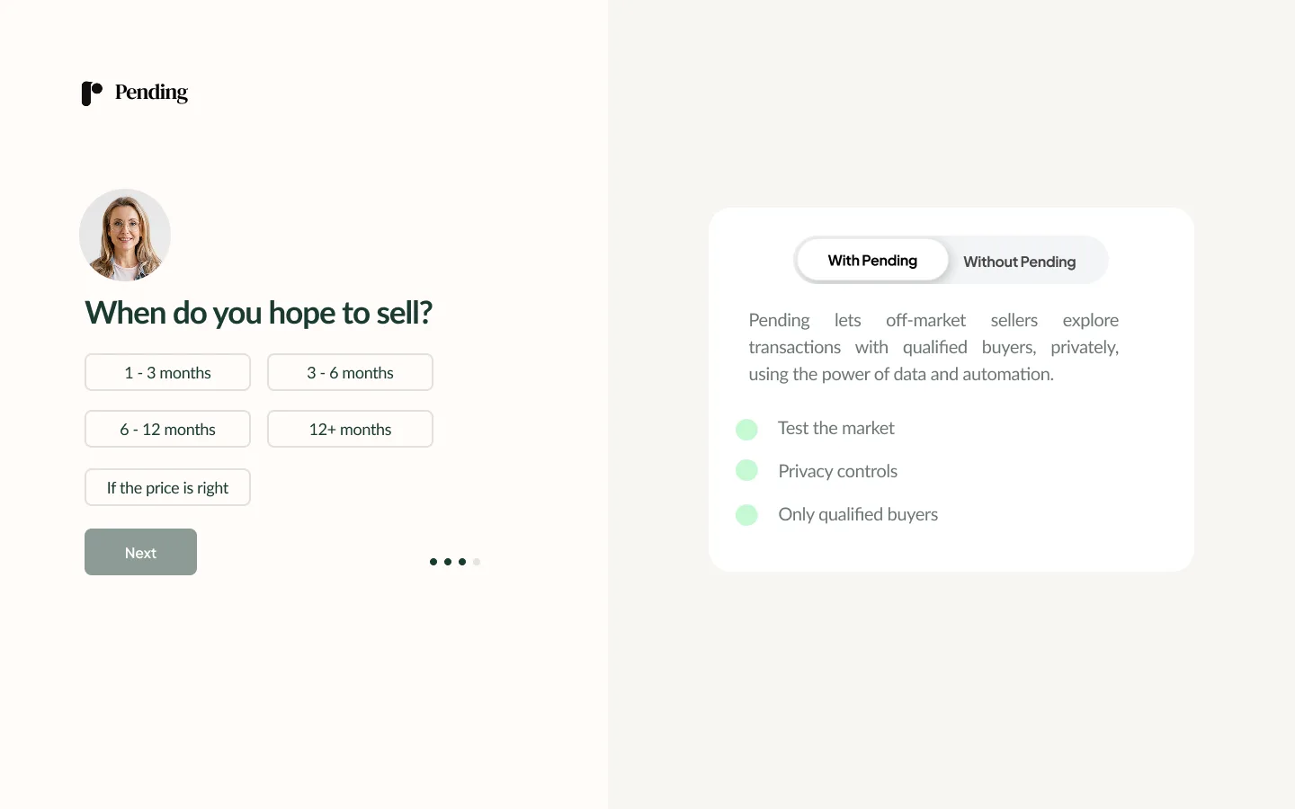
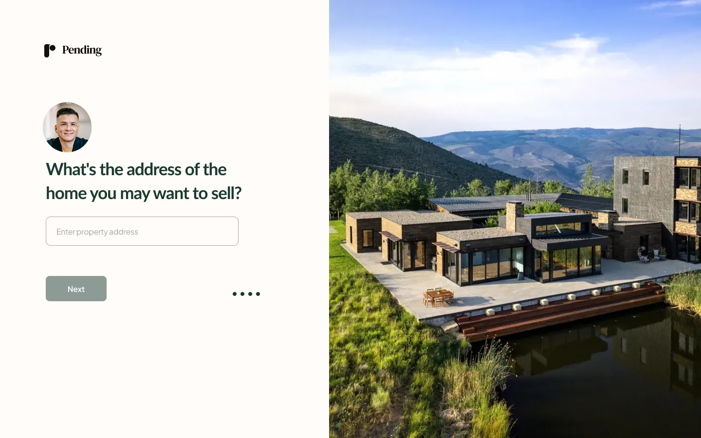
Property registration was designed as a short, guided sequence. Each screen asked for one thing. Clear value signaling at every stage made the commitment feel worthwhile, not burdensome.
High-stakes action, low-friction execution.
Offer submission simplified into a structured, guided sequence: price, contingencies, timeline. Borrowed intentionally from e-commerce checkout patterns. Counters, acceptance, and decline states were all designed with clear visual hierarchy so both sides always knew where things stood.
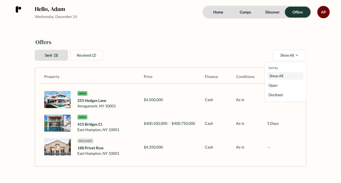
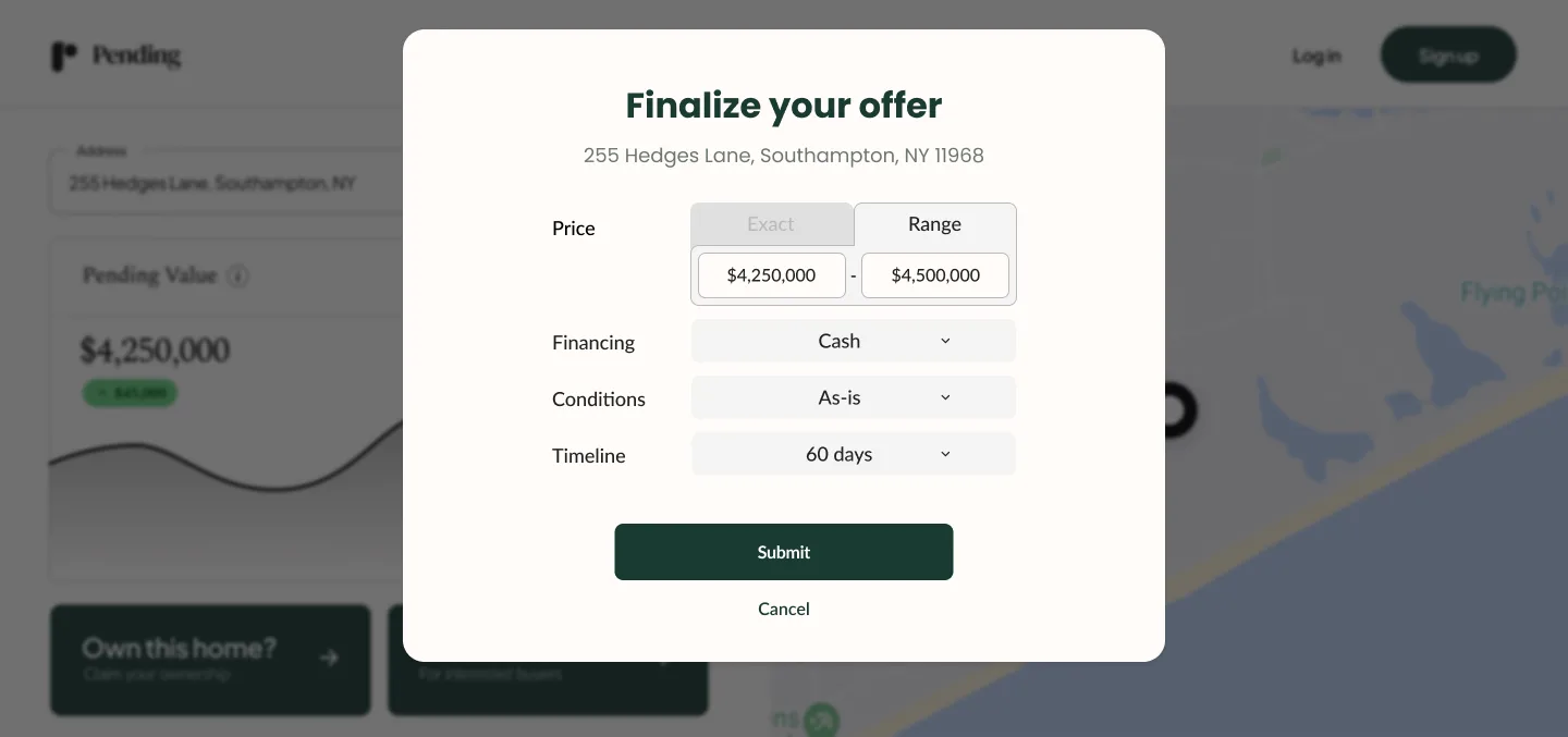
Offers dashboard with status-based layout. The guided offer submission (inset) appears as a modal overlay — a deliberate design choice to keep the dashboard as the primary context.
Eight weeks, one designer, two engineers.
Design reviews ran weekly with the full team. Engineering sprints were two weeks. Handoff was continuous rather than batched, which kept momentum without losing coherence. Most feedback came directly from the CEO and CTO. Informal validation came through the CEO's network of real estate clients. Not formal research, but enough signal to move.
The operating principle was clear from the start: ship the right V1, not the perfect one.
What made it hard
The MVP shipped on time for the accelerator demo.
The work helped the team crystallize what was actually differentiating: not another listing tool, but a private, data-grounded alternative to the traditional MLS model. That clarity led directly to a strategic pivot toward partnerships and a membership model.
Post-accelerator, I designed co-branded microsites for partner organizations and helped translate the product's value into partner narratives, extending the design work beyond the core product.
This project is where I learned what it actually means to design a product, not just screens.
Building something from scratch, with a founder-led team, under real time pressure, sharpens your instincts fast. You learn to separate what matters from what feels like it matters. You get comfortable making decisions with incomplete information. You learn that the most important design work often happens in conversations, not in Figma.
The product has since evolved. Leadership changes shifted the direction. That's the startup reality. But the foundations, the system, the decisions, the version of the product that got in front of investors, that part holds.
Good design is not how something looks. It's how confidently someone can act.
Following the accelerator, leadership changes led to a shift in product direction. This case study reflects the original MVP and foundational product vision. Additional materials available upon request.